 Americas Rugby News Rugby news from across the Americas!
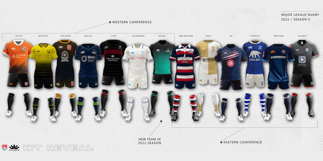
Major League Rugby has finally unveiled its kit lineup for the 2022 season. This year’s reveal comes two months later than for the 2021 season. Paladin is once again the provider and maintains a largely positive reputation for their sharp designs.
A comparison of 2018 and 2019 kits can be seen here. The 2020-2021 comparison can be seen here.
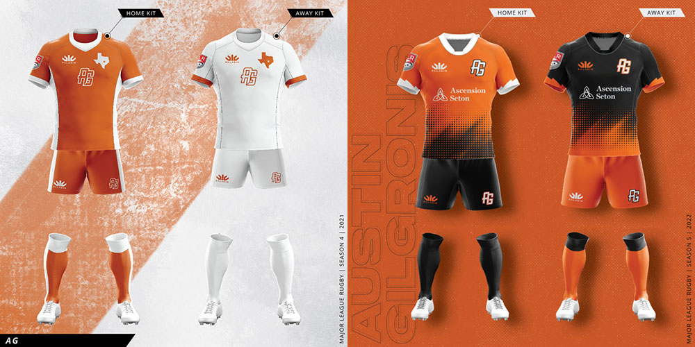
AUSTIN GILGRONIS
After simplifying their logo last season, the AG’s have now moved away from their basic orange and white stripes. This year’s set incorporates black on both stripes, with a stylized fade from orange at the midsection for each. The white strip of a year ago will not be missed with its white numbers on the bench notoriously difficult to decipher. Also new this season is the Ascension Seton sponsor logo on the front with the AG logo moved to the breast and and the Texas silhouette removed.
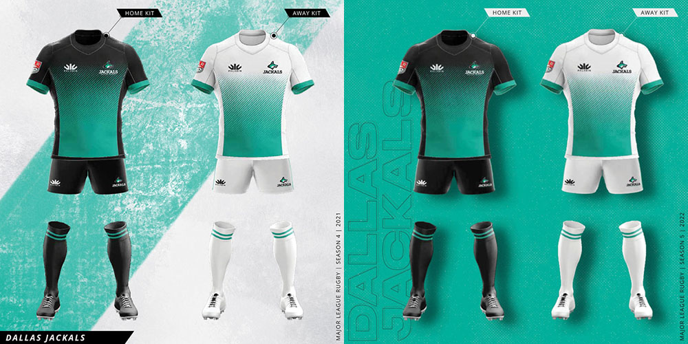
DALLAS JACKALS
They may not have taken the field last season but the Jackals, recall, did have kit ready to go. It was a strong offering and given it was never used, it makes sense to retain if for the official first season.
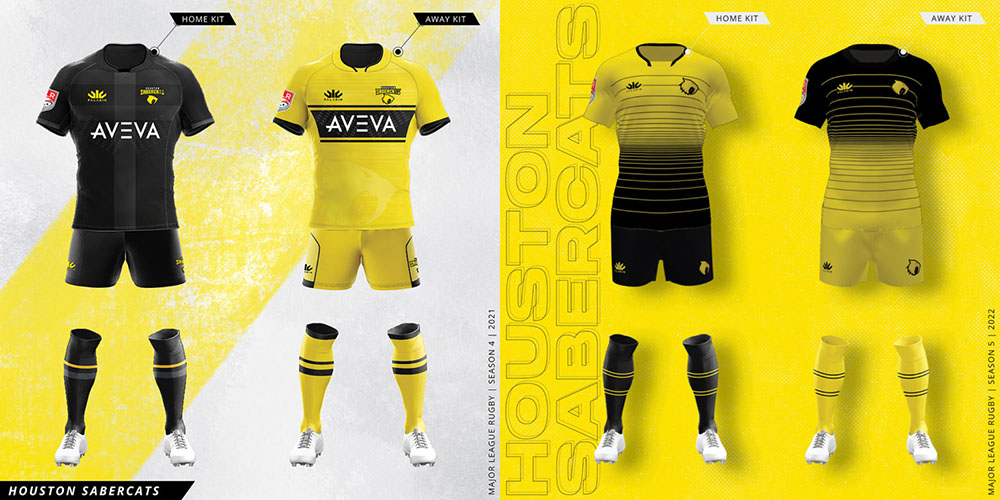
HOUSTON SABERCATS
For the first time Houston have moved away from the unicolor black and yellow strips with both kids now effectively half-and-half. Horizontal coils mark the transition with the pocket stripes dropped from the shorts. Notably the new kits feature the logo more prominently with the team name removed from the jersey which makes for a more striking design.
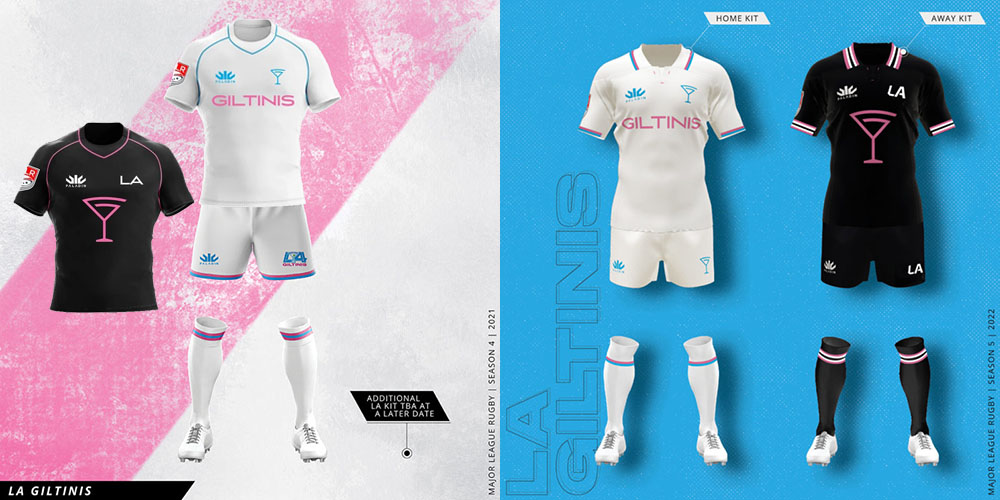
LA GILTINIS
The Giltinis showed up to last season’s reveal with a plain white strip and a logo that was subsequently ditched before the season started. Eventually they presented a plain black strip, and will retain very similar styles this season. The only noticeable change on the jersey is the removal of the blue and pink seam lines which are replaced by collar and cuff lines. The all-pink socks on the black strip have also been dumped in favor of black with pink and blue stripes.
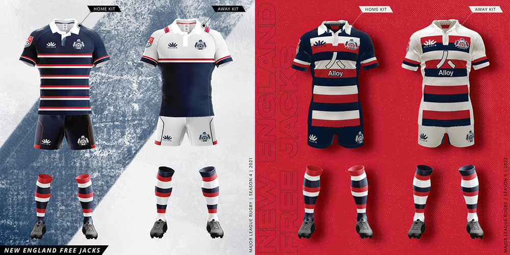
NEW ENGLAND FREE JACKS
Having earned rave reviews for their kits in each of their first two seasons, New England are again ahead of the pack with a remixed version of their collared home strip. Thicker hoops are used and this year they square off on the sides . This year’s away strip shares the same pattern with the colors rotated. A red alternate strip has also been released and deemed the ‘members jersey’. The Free Jacks are the only team to retain the traditional collar on their primary jerseys.
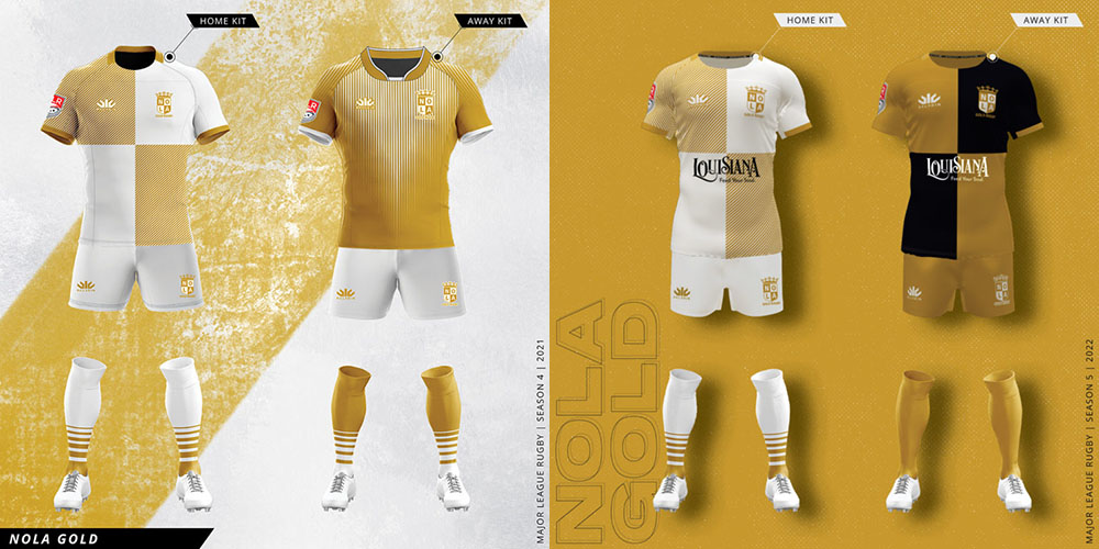
NOLA GOLD
Last season’s quartered home kit was well-received and this time is incorporated into the away kit. This season the white is replaced by black on the away kit, which makes its first appearance on a NOLA jersey. The contrast allows for the sponsor logo to be more visible. This year’s away kit also features solid gold shorts and socks. Also confirmed as returning is the Mardi Gras alternate shirt, which has become an essential item for New Orleans fans.
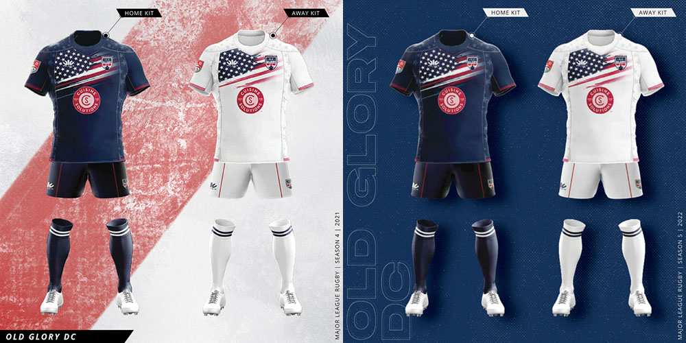
OLD GLORY DC
Last season’s stars and stripes are back with no changes at all to Old Glory’s kit in 2022. A safe choice perhaps but not winning over anyone who didn’t like it the first time.
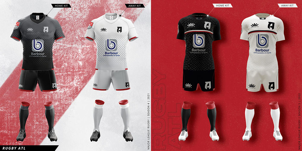
RUGBY ATL
The Ratlers’ scales continue to proliferate, this time taking over the entirety of the new strips. Gone are the gray shoulders and in are a singular horizontal bar across the chest. Red is featured more prominently on the socks and the team logo itself shows up on the front of the minimal collar.
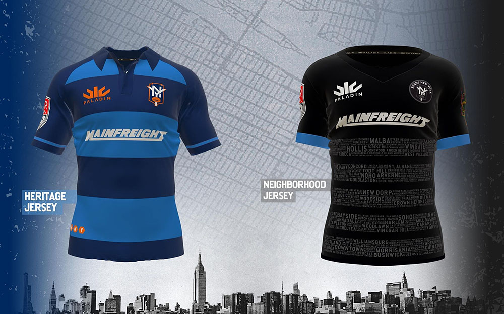
RUGBY NEW YORK
Now officially gone is the ‘United’ from the name though the logo merely drops the word and is otherwise unchanged. There are big changes to the shirts, however, with a sublimated Statue of Liberty replacing last season’s crosshatch and horizontal neighborhood designs. Orange as a primary color for the away strip has given way to white, with a new Mainfreight sponsor logo making its first appearance. The team has also unveiled two alternate designs…
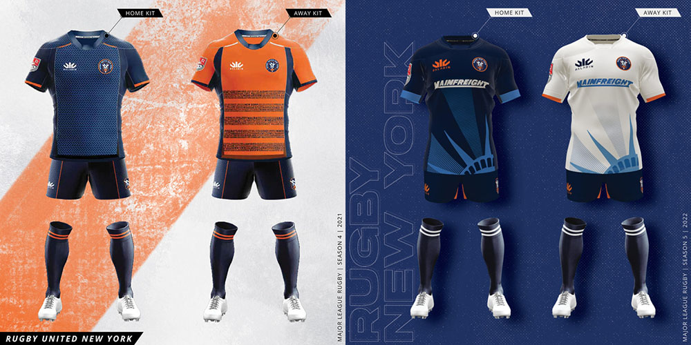
…the first of which has been labeled the ‘heritage jersey’ and features simple horizontal hoops and a navy traditional collar. It also discards the circular logo with only the NY shield design used, a strong visual that the team would have been a better choice for the primary kits. The neighborhood design remains as a black-and-white alternate.
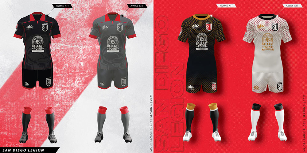
SAN DIEGO LEGION
After making drastic changes to their kit last year, the Legion have left many fans confused by their latest offering. There is almost no red to be found on the new uniforms, with a faded gold chainmail pattern replacing the sublimated legionnaire helmet. Gray is discarded from the away strip in favor of a return to white with a dark red or brown shade used for the pattern.
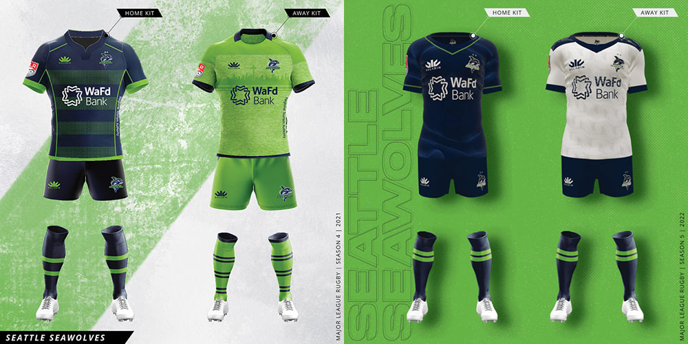
SEATTLE SEAWOLVES
With a major overhaul to their playing roster, the Seawolves have appropriately opted for a rethink on their kits as well. For the first time the traditional blue-and-green hoops are gone with neon blue sonar waves incorporated onto the new navy home strip. The lime green kits are gone entirely and it’s a white jersey for the away kit, with a sublimated orca fin pattern across the front and back and green waves across the shoulders.
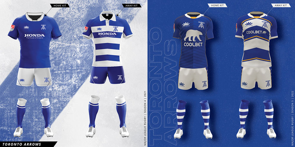
TORONTO ARROWS
Previous criticism that Toronto’s designs are too conservative cannot be raised this year. While the main color scheme remains the same, this year the team has incorporated gold seams on the home strip and even more prominent bars on the away shirt. Both feature a chevron pattern across the front to fit the Arrows scheme. Last season’s traditional collars on the away strip are gone, while the shorts feature a striped pattern down the sides. Coolbet is the new title sponsor and if there is one complaint, it’s that the bear logo on the home strip is obnoxiously large.
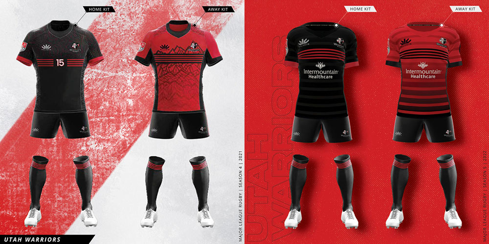
UTAH WARRIORS
As with last season it’s relatively minor alterations from Utah with the red and black strips featuring horizontal chest stripes. The background pattern has changed on both. Gone are the Polynesian design and mountain range, replaced on both by more fading horizontal hoops. The ‘Warriors 5 Years’ patch is present on the left sleeve of each.